Admin UI/UX Adjustments
- UI/UX
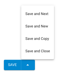
For most modules when adding an item there is a “Save” or “Save and New” button. I would like the “Save and New” button to be there even when editing an item not just when creating a new item.

In regards to the “Save” or “Save and New” buttons I’ve been wondering if it might also be nice to have a third “Save and Close”
This would remove the current 2step process required to get back to the module item list.
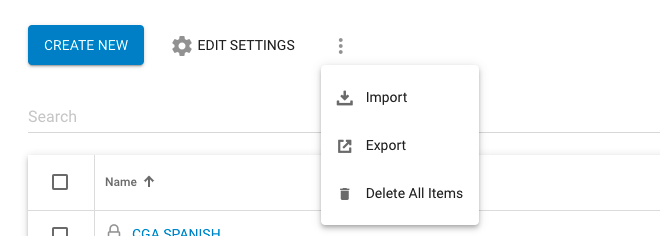
Under CRM > Form Submissions, move the “Delete All Items” to the options menu like in Custome Modules. This will prevent stupid (me) from deleting everything. I filtered responses to a form and clicked delete all items thinking it would delete all filtered items. whoops.
Current with blue “Delete All Items” button at the bottom
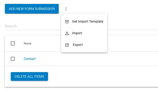
Proposed with it in the options menu
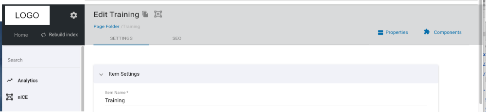
In Custom Modules under the Edit Setting menu, there are three icons
- Duplicate
- Reindex Module
- Search (enable/disable)
Shown below

Reindex Module gives you no feedback as to if it is doing anything. There needs to be some kind of “Working” message and “Complete Message”
Search (enable/disable) gives you a “Completed Message” but no “Working” message and if the module has a lot of items it takes a bit.
I assume both will process in the background but I am not sure on that either. If so it would be nice to know so I can move on to other things after triggering.
Adding to the ‘Save…’ button:
Save and Next (moving you to the next tab - usually the SEO tab)
Save and Copy (duplicating the item you just made)
Put into a combo button something like this:
Add the item preview icon at the top of item edit pages so it’s readily accessible (the current Preview link is often out of reach when you want it).
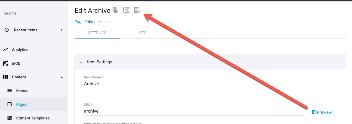
If you want the preview button to be easily accessed then I think it needs to be a sticky menu at the top. In fact, I think the whole page needs a bit of work because there is a lot of waste at the top of the admin page with that black bar that has no real use. I posted this a while back. It’s rough but it gets the point across.
Moving what’s in the current black sticky menu to the side menu would open up the top and allow for a new sticky menu based on the module. This would make things very handy as you wouldn’t have to scroll up every time you need one of these items we actually use.